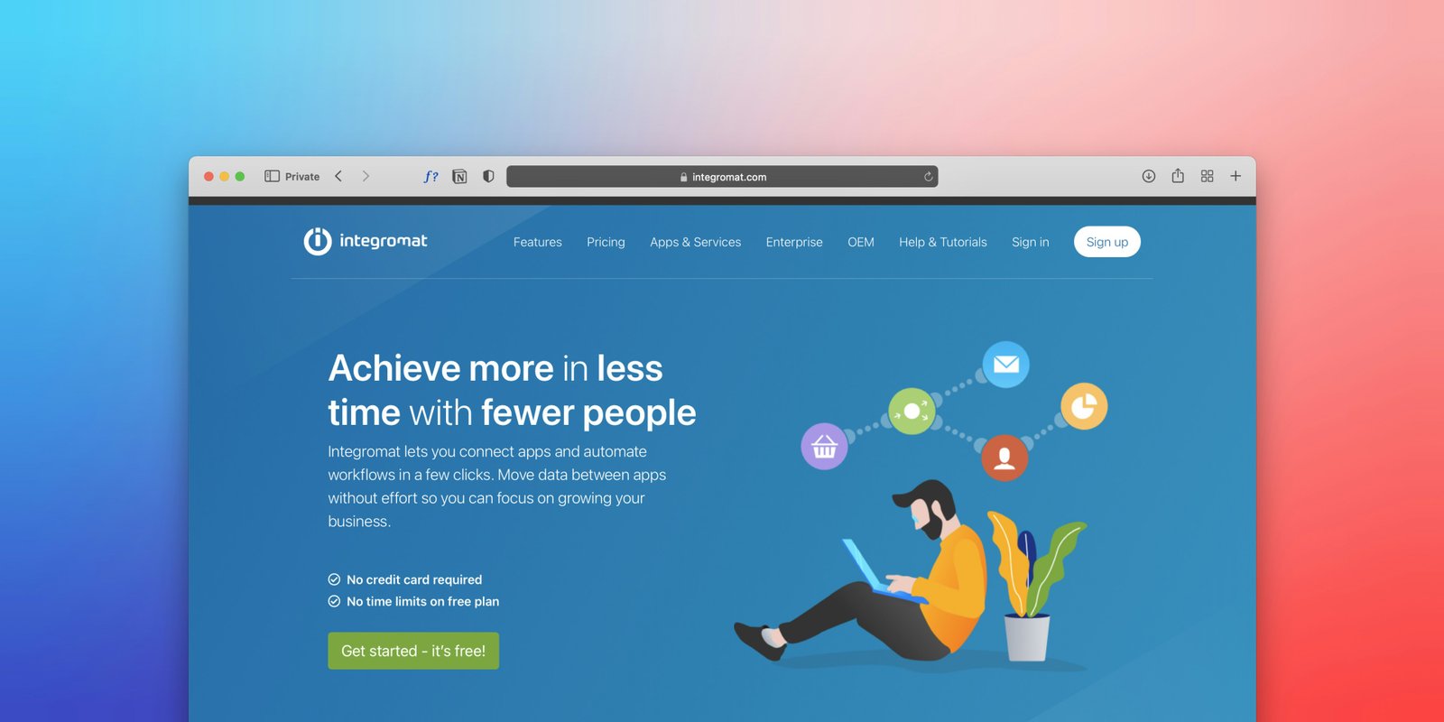
Website design refers not only to layout, color scheme and typography but also to images. The use of high-quality and professional images will make the website look better and more attractive, while careless and unprofessional images will leave a bad impression.
Background removal is one of the often overlooked tools that allows creating an improved design by eliminating unnecessary background clutter. It helps to achieve a higher quality of digital assets, which directly impacts the end-user experience by enabling more engaging interfaces and better organization.
Background removal finds its application in numerous areas of website design, from product photography on e-commerce sites to creating landing pages and landing page banners. It makes images more adaptable and better fitting within the website’s design to create a unified appearance and eliminate distractions.
In this article, you will learn how important the background removal is for the modern website design and you will explore its importance from different angles in order to see how it can improve the user experience.
Faster Loading Speeds with Optimized Transparent Images
Users in today's environment demand fast loading websites. If a website takes more than 2-3 seconds to load, a lot of visitors to this website will instantly leave and this is known as the "bounce rate" which means users are leaving site straight away. The faster your website the higher the chances of users stopping and viewing your site.
By removing the background they often make images more adaptable and make it easier for a designer to size down those files to be web ready. That is because as small as we all try to keep files when doing design there is always more leeway when we only care about what the image will end up looking like. This optimization will serve as a performance booster to websites, allowing users a more pleasant surfing experience and it has an affect on website ranking because Google favors sites that load in real time.
The pictures with transparent background can have smaller file sizes than regular images. Finally, it will turn out significantly smaller in size and will be ideal for modern websites that use the WebP format.
Creating Modern Hero Sections with Transparent Images
I think that the hero section of a website is like the shop front of a building. If a first impression is a good one, then the customer will be encouraged to venture deeper inside the establishment, but if the shop front is confusing in any way, the potential customer will walk on by. Therefore it is so important to make the hero section right the first time.
Images with transparent backgrounds give a creative freedom which rectangular background cannot provide. I have noticed while working on my own projects that having an image or a product picture with transparent background makes them a part of the website design. For example, using a cut-out image on a fitness coach’s website and placing it on a gradient background makes the photo not feel boxed in by the white background, but instead be a part of the website’s design thus making it look more elegant.
Using transparent images for SaaS and landing page projects can make the design process much easier. By having the background transparent and the subject on it, one can simply overlay different gradients, shapes, or colors for different seasons.
The transparency enables to elevate the hierarchy of the page and its visual structure, while also helping the visitor to identify, at first glance, where the figure is and where the background is; in other words, the hero section will not overload the customer with information. It will be much easier to navigate and focus on the main page content.
Responsive Design: Making Images Work Across All Devices
Nowadays, websites are not designed exclusively for computers. People can access them from their desktops, laptops, and tablets but mostly people use their phones. In our previous projects, we faced the challenge that the site looked great on the computer but was practically unusable on the phone because of the images. The images either occupied too much space or, on the contrary, were not visible enough. Fortunately, transparent images became our salvation. They have solved the problem because, unlike opaque ones, they do not have a background, so it becomes much easier to scale them for different screen sizes.
Let’s suppose a website selling smartwatches wants an image of a watch with a transparent background. If the image of the product had a white or colored background, it would take up space on a mobile screen. Instead, making a cutout of the watch in the image might help place that visual element wherever you want.
Moreover, by using transparent images, it is possible to benefit by employing responsive design tools, such as adaptive layout. By using the same image for desktop, tablet, and mobile versions of the website, which is possible with adaptive layout, it will be possible to provide the same visual for different screens. Moreover, the image will look nice on any background due to its transparency.
All the benefits listed above suggest that using transparent images allows to build a more flexible design. This is specifically beneficial for the modern mobile-first approach, where screen space is limited to the one that can be accommodated by the user’s device. By utilizing the potential of a transparent image, the actual content becomes more flexible and, therefore, allows to deliver a better experience to both desktop and mobile users.
Why Clean Product Cutouts Improve UI/UX
On product oriented platforms, images are the key element to engage customers and provide them with the necessary information. Be it items for sale or portfolios, any business website needs cutouts to make the items visible to the audience. Having analyzed the main elements of cutouts, one can understand how they play an essential role in creating an attractive website.
First and foremost, using product images with a clean background puts the given item in the focus of the audience. By eliminating other objects and the setting in which the product is placed, the company directs the customer’s attention to the item. As a result, the audience gets more value from the images since they can comprehend the item’s attributes and qualities easily and quickly.
Moreover, the elimination of useless data reduces the cognitive load of the users. Simply put, there is no need to analyze what elements belong to the product and what does not when the item is presented clearly. A clean image offers a more pleasurable experience because people enjoy looking at things without effort. Another advantage of cutting out irrelevant components is the enhanced consistency that the company gains across its website. If every photograph follows the same concept and style, the website appears to be more attractive and organized. The overall presentation of the products becomes uniform, thereby improving the browsing experience.
Ultimately, an optimized product image is beneficial for the majority of users. By focusing on a given item and removing unnecessary elements, companies create a consistent and appealing visual display. The advantages range from a more pleasurable browsing session to improved comprehension of the items’ attributes. All in all, the cutouts that feature items with clean backgrounds benefit the company and the customers by improving the website’s quality.
Using Transparent Images in Banners and CTAs
Banner and CTA sections are portions of a website designed to motivate a user to take a certain action. This action can range from subscribing to a newsletter, buying a product, beginning a free trial, or getting a demo. Lots of websites fail at conversions simply due to fuzzy CTA sections; the user comes to a page and does not know how to move forward. For one SaaS project, I saw that there was a ton of information but a completely vague CTA section that nobody was clicking on and once I cleaned up the design of the page and made the CTA section the focus of attention, it was clicked on much more.
A transparent image could be a wonderful addition to the banners and Call-to-Action sections because it will enable the background to become a part of the media. The image will match the background, creating an excellent color scheme that other images would not provide. It will make the objects on the image or the illustration blend with the background to appear as if they are part of the website.
Moreover, it seems that the use of transparent images in banners and call-to-action sections makes them more professional. When choosing images for CTA sections, it is vital to remember that the primary purpose of such sections is to help the users understand what they need to do. A transparent image would enable the designers to create a CTA section that appears to be a seamless part of the website, not an image placed over the background. In addition, the use of such images may result in banners and CTA sections that are easier to read and attract the users’ attention. The transparent image will ensure that the headline and other elements on the CTA section can be seen clearly. As a result, the CTA section will have a higher chance of engaging users since the image would not hide the important content and information, making it possible for the users to comprehend what they need to do.
All in all, the use of transparent images can make banners and call-to-action sections look more professional, engaging, and effective.
Conclusion
Background removal is no longer just another graphic design tool – in web design, it can help optimize websites by enabling faster page loading, building eye-catching hero sections, and making responsive designs more accessible. It also allows product presentation on a white background, the creation of banners and CTAs in high quality.
My advice is to take a look at your website through the eyes of not only a designer or developer but also through the eyes of a visitor. Are your images taking up too much space, are your items pictures clear, do the images in certain places take away from the visitors’ focus? I can tell you from personal experience that sometimes its not a whole website overhaul that's needed, just one image or one clearer picture or a better cut-out and your website is now ten times more professional!
If you want to improve your web page’s aesthetics, you may want to consider using BG Erasers. This tool can take the background off of any image you choose, and this can assist you when inserting an image onto a web page or elsewhere online (such as a catalog, banner, and/or landing page). I always suggest that someone review their graphic assets prior to publishing any website or designing for a project since these items are crucial to the look and feel and the overall performance of the site. You can check out BG Erasers and see what benefits they can bring to your web design.